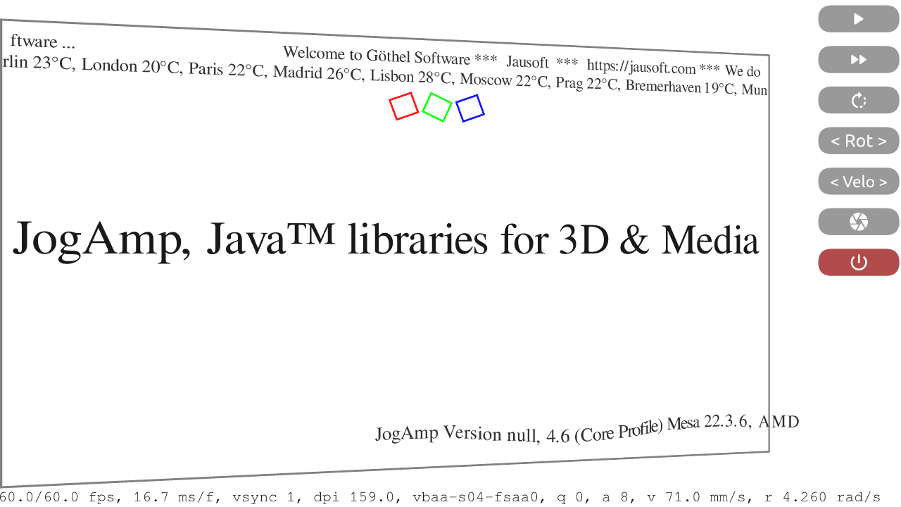
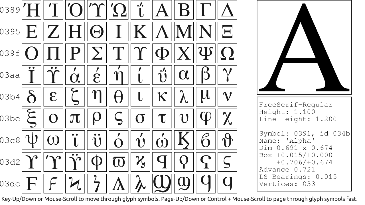
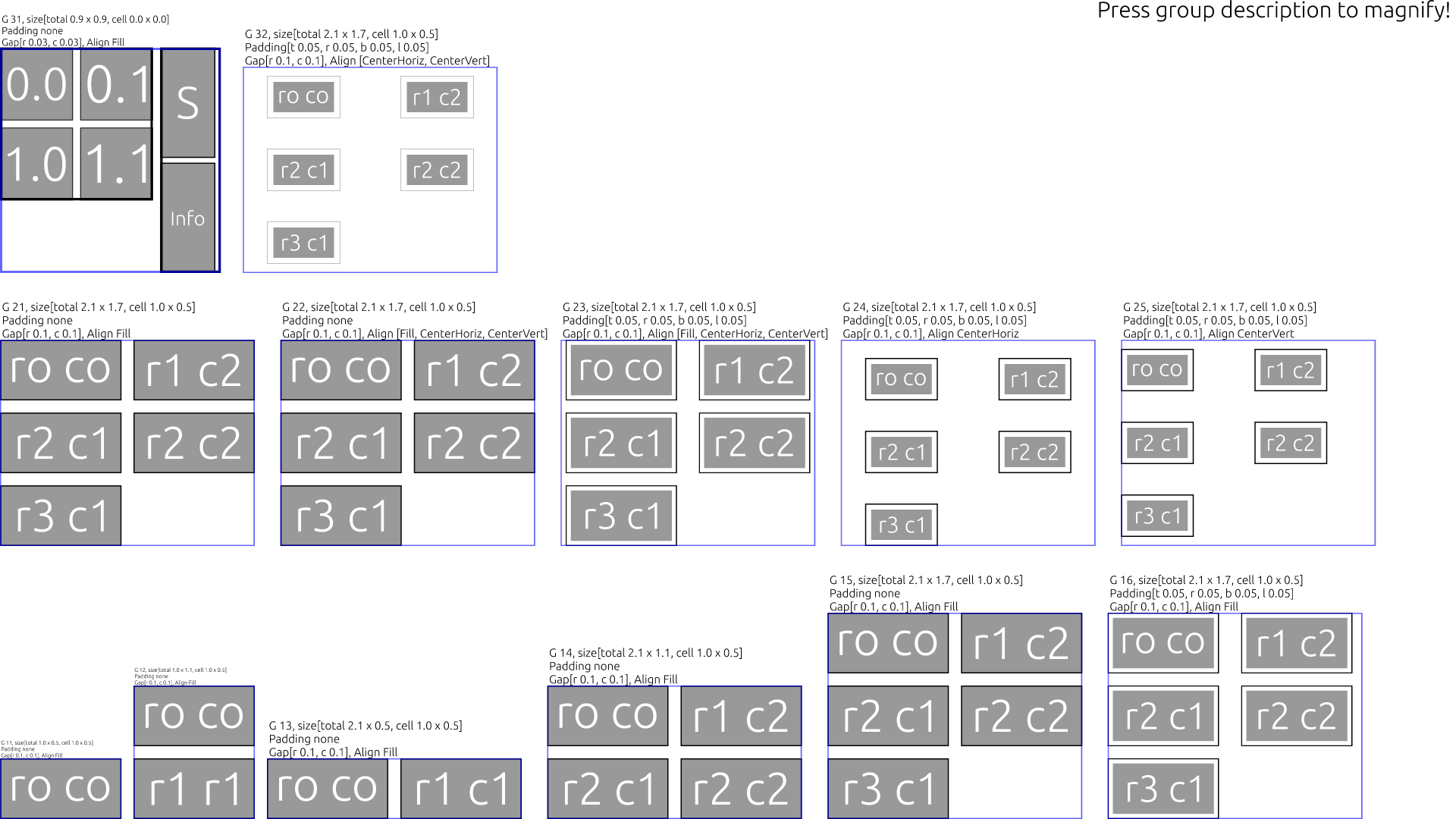
Continuing the Graph Type Rendering and UI saga with some functional updates. Here our new CSS alike Grid and Box Layout as well a glimpse into the migrated symbol fonts via our FontView01. You may also check our Bugzilla in regards to GraphUI or for the JOGL / Graph module as well as the easier to access wiki page of ours.
Walking through the source code is pretty boring, so I will just link a few examples regarding the new layout feature from the demo code here.
UISceneDemo03’s right hand side group of buttons.
Notable some buttons contain an newly integrated symbol font, which can be easily utilized by a Glyph name lookup and toggle’able Button support.
        buttonsRight.setLayout(new GridLayout(buttonWidth, buttonHeight,
                      Alignment.Fill,
                      new Gap(buttonHeight*0.50f, buttonWidth*0.10f), 7));
        {
            final Button button = new Button(options.renderModes, fontSymbols,
                        fontSymbols.getUTF16String("play_arrow"),
                        fontSymbols.getUTF16String("pause"),
                        buttonWidth, buttonHeight, buttonZOffset);
            button.setSpacing(symSpacing, fixedSymSize);
            button.onToggle((final Shape s) -> {
                System.err.println("Play/Pause "+s);
                animGroup.setTickPaused ( s.isToggleOn() );
                if( s.isToggleOn() ) {
                    animGroup.setTickPaused ( false );
                    if( null != mPlayer ) {
                        mPlayer.resume();
                    }
                } else {
                    animGroup.setTickPaused ( true );
                    if( null != mPlayer ) {
                        mPlayer.pause(false);
                    }
                }
            });
            button.setToggle(true); // on == play
            buttonsRight.addShape(button);
        }
which actually was there all the time but somehow ignored.
The calculated bounding box of one text line was always too big,
hence a label was always positioned too low in the Button – not centered correctly.
While adding a convenient way to use toggable symbols and hence adding the option
to obey a font’s fixed em-size – this issue had to be resolved.
We used the font’s ascend for whitespace and undefined Glyphs,
which exceeds the height of used label text and hence ruined the layout. 😉
and UILayoutBox01 for the BoxLayout
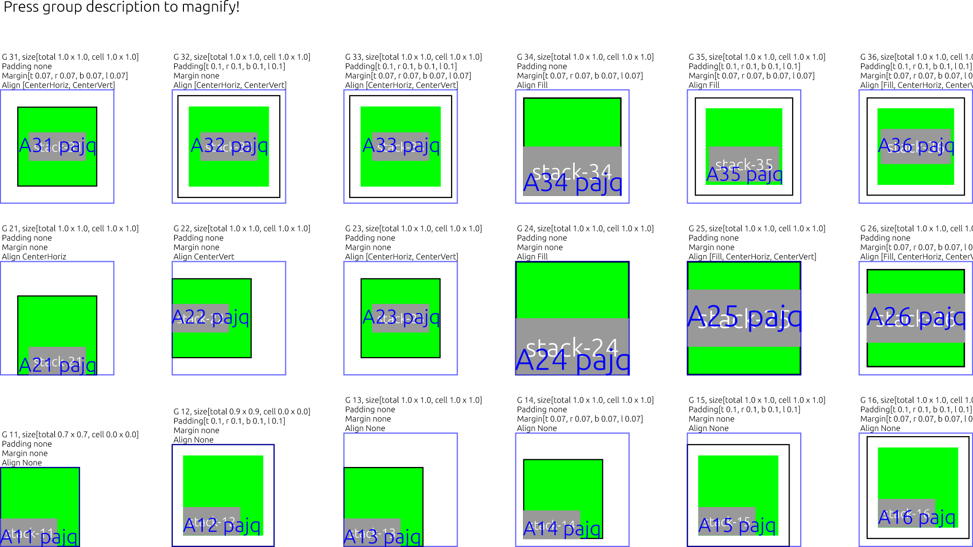
The BoxLayout was mostly used to group Shapes in a box like in FontView01, the GlyphShape and the underline box.
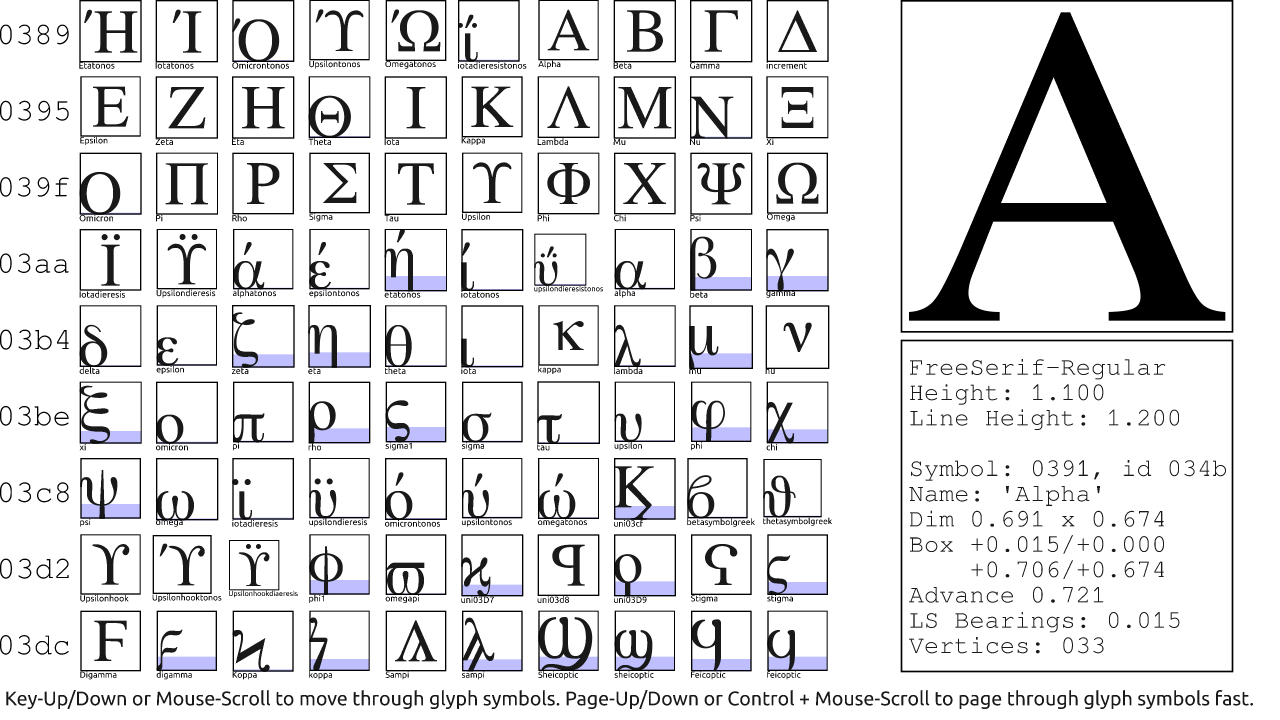
The underline hack is sub-optimum due to skipping center in the BoxLayout,
here is a version without it
Here one more set of Demo pictures from UISceneDemo02
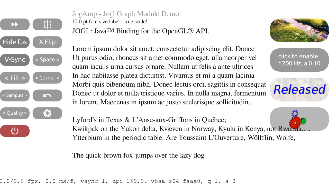
… and
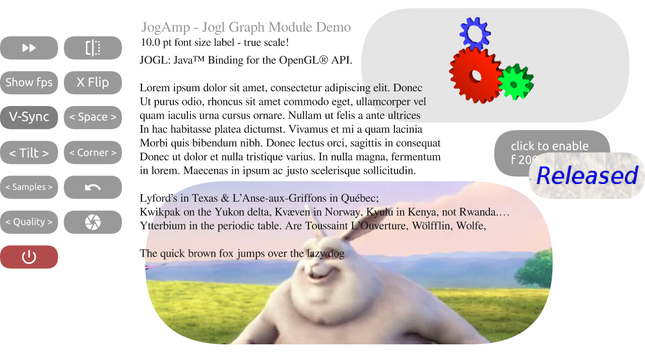
More updates on already checked-in code and new stuff soon …
***
And now .. the painful but required call for related project work, funding or otherwise.
All big & medium sized firms – as well other hybrid commercial projects,
are strongly invited to contact me to discuss the next steps forward (if any).
I would suggest to setup meetings with their stakeholders and discuss a plan forward.
A one person full time compensation might be enough, two person support would be awesome.
See How to pay professional maintainers.
^^ this is not directed to any hobby or small-biz entity using the project,
but more so directed at whats left in the ethics department of the bigger corps & orgs :-/
Interestingly enough, it always were the small biz corps supporting this project the most!
THANK YOU!
